2012 — Before
Right at the beginning the XING image language poses a challenge. It’s comprised of random stock photos and very much represents the old working world: stiff, formal, colour-less, artificial, aloof.

2013 — First steps
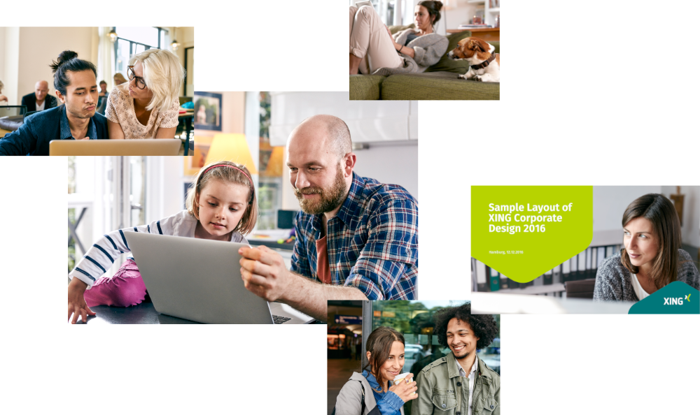
Due to my eCommerce background I have supported the very first pool shoot (2013) in order to achieve a much needed update to the brand image language: Casual instead of tie and suit, with locations wherever modern work actually happens.

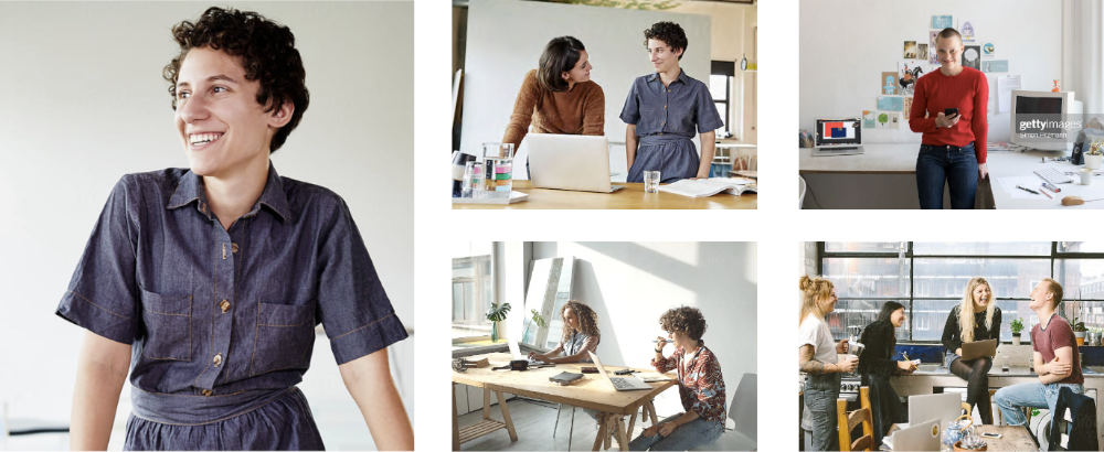
2016 — Brand pool shoot
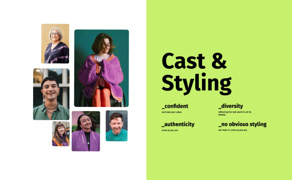
From 2016 on I conduct photo shoots myself including planning, briefing, casting, stakeholder management, styling briefs and art direction while also overseeing the post production. The goal is to showcase the lived reality of professionals in all aspects of life, with authenticity and simply likeable.
2020 — Let there be light
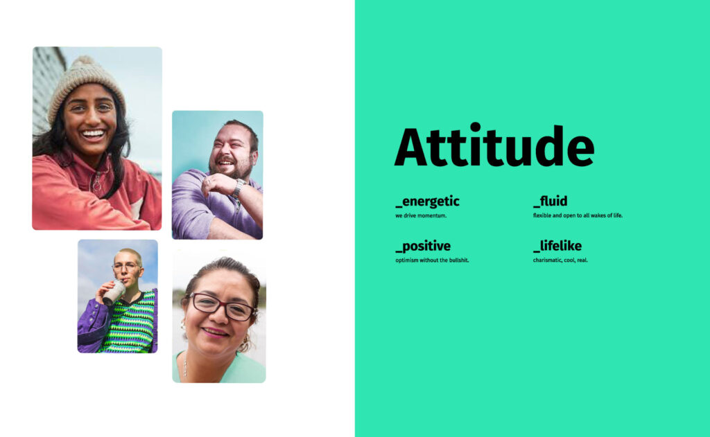
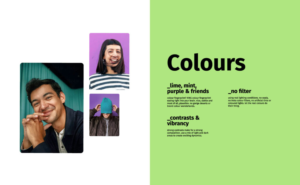
A brand refresh brings a new corporate design. For this I develop a new image language that takes our brand personality to the next level:
- bright
- approachable
- diverse
- with vibrant splashes of colour
- a high depth of field
This poses as an antidote to the prevalent, highly polished stock image look by focussing strongly on authenticity and immediacy.
There also is a stronger focus on storytelling.
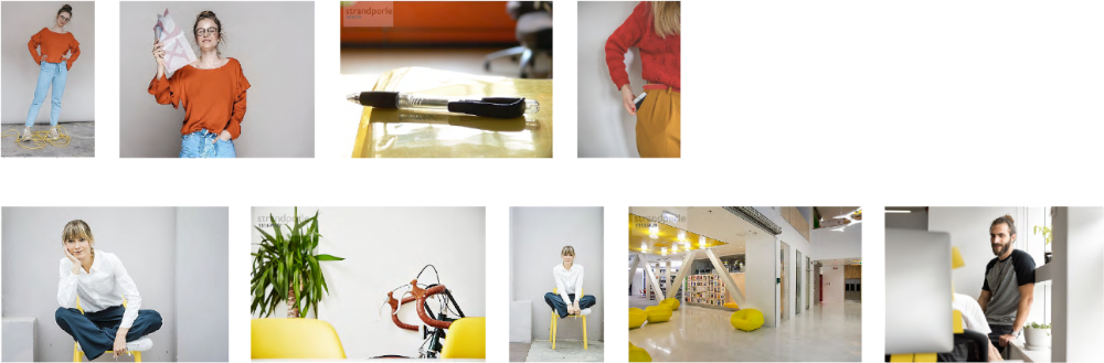
For the new look I’m conducting a pool shoot and work with image agencies to create a bespoke brand stock pool.
User surveys and in-person tests show a clear preference for the new material.
“Finally real people, not so stuck up, working 9 to 5 with nothing to laugh about.”
“I’m so happy you finally show more diverse people.”
“This looks like the people enjoy their work. To be honest, I’d like to join them!”
(Voices from a user feedback event)

The brightly lit clarity works perfectly with the new design assets.
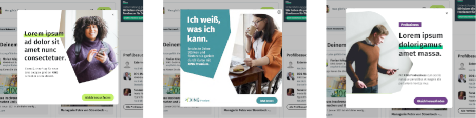
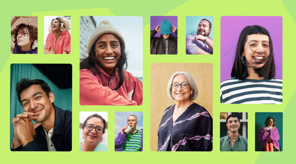
2024 — Bigger, bolder, better business
The XING brand gets a strategic repositioning. With this comes a radical rejuvenation of the design. For this we need an image language that can keep up with the colourful, contrast-rich palette and the cheeky design elements.
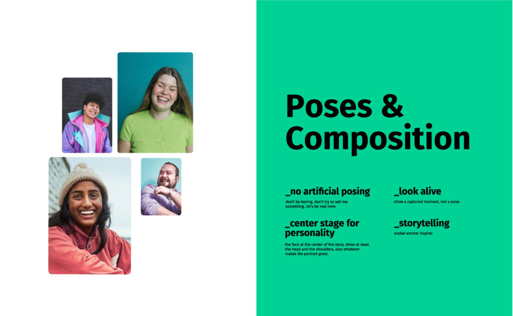
Another challenge is to get our marketing teams ready for action fast and cost-effectively, in order to bring the perception shift on the road immediately. For this I create a curated stock image pool that assures brand consistency.
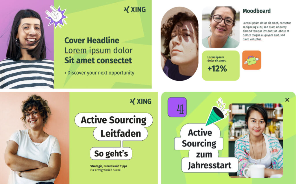
After an exploration phase with user surveys I arrive at an image language that utilises strong portraits which turn our users into the heroes of their own careers. Colourful, diverse, with strong personalities, enthusiastic but most of all: without the bullshit.